Alberich Potter
About me
| Name | Alberich Potter |
|---|---|
| Location | England |
| User since | July 2, 2010 |
| Number of add-ons developed | 503 themes |
| Average rating of developer's add-ons | Rated 4 out of 5 stars |


My Reviews
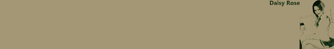
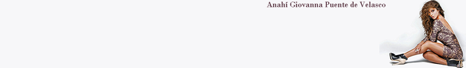
Chanel Madamoiselle Blake Lively
Rated 3 out of 5 stars
Atmospheric theme somewhat spoiled by the fact that the top of Blake Lively's head has been cropped off.
amor escrito
Rated 4 out of 5 stars
I love writing too (assuming my translation is correct) but I would say this is more like a doodle. Nevertheless it makes for a good theme.
Fleur Vintage10
Rated 3 out of 5 stars
Today's random selection, and quite attractive in its own way, but not really my cup of tea.
Gooby pls
Rated 1 out of 5 stars
It's not often these days that I criticise a theme for needing too many additional rows of blank toolbars to see it properly because, having started creating my own, I realise how difficult it is to concentrate the important parts of the image into the top third of the allowed 200 pixels, but this is one instance where that criticism is justified. The character is far too big and I need 6 additional rows to see it all, and am then left with a massive wall of empty white space at the top of my screen. And I'm not sure what Gooby pls is meant to be; it looks like a badly drawn Donald Duck to me!
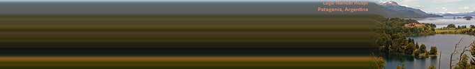
Spring Rest
Rated 4 out of 5 stars
Mmmm....think I'll forget about my computer today and go and sit in the garden with a good book! Your usual high standard.
ARABIAN EYES RED WAVE
Rated 4 out of 5 stars
Stunningly beautiful eyes and a great colour scheme. The cropping around the eyes, however, is a little too severe, with the top of her left eyelid missing, which leads me to deduct one star.
Romance On The Moonlight
Rated 2 out of 5 stars
Nice idea but extremely poor execution with badly blurred and noisy image quality.
boatman and river
Rated 2 out of 5 stars
I love the image but not at all keen on it being repeated and mirrored and with that gap between. The other problem is that the key part of the picture - the boatman - is at the bottom, necessitating lots of additional toolbars in order to be able to see it.
Spring Vines
Rated 4 out of 5 stars
I'm not normally a big fan of cartoon type themes, but this is simple, non-intrusive, fresh and attractive. Your usual high standard.
Athelde
Rated 4 out of 5 stars
Attractive, non-intrusive colour scheme. The bright parts are just a little too bright for my taste, but by using my preferred configuration of only one additional blank toolbar row these are hidden.
TKMN AKB
Rated 3 out of 5 stars
I have to confess that it doesn't really appeal to me; just too much black and too little other content.
Support Outlaws-1
Rated 4 out of 5 stars
Good, simple theme and colour scheme. For my display set up the font size could do with being a point or two lower as the S of Support overlaps two of my toolbar icons, but it's not a major problem as I can still see them.
KU Jayhawk black
Rated 4 out of 5 stars
I like it, even though I have no affiliations with the University of Kansas!
FirstPersonaByRichardS
Rated 4 out of 5 stars
I do quite like plain, simple themes, and this certainly falls into that category. Wonder why you never chose to create any more after this?
osis 16 mlg
Rated 3 out of 5 stars
Not bad, and I like the green textured background. But the text needs to be below or to the left of the image so that the number of rows of additional blank toolbars required can be reduced.
Firefox Kilates
Rated 4 out of 5 stars
I really like the golden colour scheme, not so keen on the text. And I've no idea what Kilates means!
Germany Fahne
Rated 4 out of 5 stars
I love the vibrant colours of the German flag, but my dilemma with this is whether to have sufficient rows of additional toolbars in order to get some of the yellow band on screen. In the end I decided not too, but that's just a personal choice which doesn't detract from the theme. Maybe you should have yellow as the footer instead of black?
To create your own collections, you must have a Mozilla Add-ons account.